Showing posts with label Blog Design. Show all posts

Wednesday, January 27, 2016

"I'm stumped - what should I blog about?"

e-Communication students have occasional required blog posts of various types that we think are important to assist in learning or demonstrate learning of e-Comm material.  However, to really have an interesting and well-rounded blog, you may want to also include other kinds of posts.


"What could I possibly blog about that would be interesting to others?"


Oh - about a hundred things.  Seriously.  In these two posts, a girl, obsessed lists many possible blogging ideas. If you're stuck on figuring out what to write - scan through these and chances are you'll be back writing great posts in no time:

Oh - and, by the waaaay... one category in this year's eMagine competition is for blogs. 

(Also see our To-Do List For a Better Blog.)


Friday, March 13, 2015

e-Comm Student Blog of the Week

About Me, Bio – whatever you want to call it –
your blog should have one! This is a great example.
This week's Blog Of the Week belongs to Josh Riess (Web Focus, Junior).

Josh's blog stands out for its classy, professional, and clean design - especially evident on his About Me page.

Does your blog have an About Me page yet?

Congrats, Josh!


Monday, March 2, 2015

To-Do List for a Better Blog

Add an HTML/JavaScript Gadget: 
eravens.blogspot.com/2014/12/adding-htmljavascript-gadget.html

Label Your Posts:
eravens.blogspot.com/2014/12/label-your-posts.html

Customizing Your Blog with the Template Editor: (also see CARP)
eravens.blogspot.com/2014/12/customizing-your-blog-template-with.html

Customizing with your own CSS: (also see CARP)
eravens.blogspot.com/2014/12/customizing-your-blog-with-your-own-css.html

Making Portfolio pages (and/or posts):
eravens.blogspot.com/2014/12/making-portfolio-pages.html

Making and installing your own Favicon:

eravens.blogspot.com/2014/12/making-and-installing-your-custom.html

Add your logo (or background image) to your Blogger Header:
eravens.blogspot.com/2015/02/how-to-add-logo-to-your-blogger-banner.html

What makes a good blog post? Content, Voice, and Presentation! Edit some of your recent posts to make them better in these three areas.
eravens.blogspot.com/2014/12/what-makes-good-blog-post.html

The Presentation aspect of a good blog post – yep, it’s your old friend, CARP:
eravens.blogspot.com/2015/02/what-is-carp.html

Part making a blog successful is Social Media. We don’t have instructions on the eRavens blog for that yet:
  • Add social media – g+ gadget
  • Support your blog posts with Twitter (a professional account), g+ - when you make a new post, tweet it. Facebook and other options too…. 
  • Some of this you'll have to do when not on the school network.

Wednesday, February 25, 2015

How to add a logo to your Blogger banner

My Blogger template doesn't have an option for a header logo, whatever will I do?

Use this simple CSS "hack" to insert your logo in the background of the header!


Before:

So, here's the header for this blog - the way it looked without our logo.


Uploading the image:

Our logo had not been used in any posts up to this point, so we made a new post, clicked the button to add an image (right of the Link button) and uploaded it.  This logo is white, with a transparent background, so it doesn't show on the white post background you see here. (We then saved this post, but didn't publish it.)


Grabbing the image's URL:

We clicked on the HTML button to see the code.  Yeah, it looks scary, but don't worry - it won't hurt you.
We located the image tag (it has img in it) and selected and copied the url of the image that we fount between the quotes.


Locating the applicable CSS:


In another browser tab (using Firefox or Chrome), we selected everything in our header, and chose Inspect Element.


We clicked up the list of code statements on the left, until we found the one that had the blue header background in it - figuring that this would also be the section where we should put the background image.  Looks like this div is in a class called .header-outer.


Hacking the CSS!:

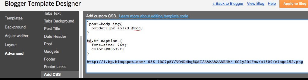
Back in the other tab, we did Design > Template > Customize, then Advanced > Add CSS.

We pasted the URL of the logo image that we copied a few steps ago, just to have it here.


In the other tab, back in the CSS showing at the lower-right, we copied the .header-outer part.


Then we pasted that in front of the logo's url - and added in the rest of the CSS you see here.  Don't forget the starting and closing braces.

You can experiment with the other CSS rules for background and padding - these are just the settings that worked for our particular blog template.  Yours will be different.


After:

Once the preview shows it looking the way we want, we press the orange Apply to Blog button, and there we go!


Do you have a request for a Blogger How-To tutorial?  Comment below to let us know!


Friday, February 6, 2015

What is CARP?

It's an easy-to-remember way to make everything you do look great!


Contrast 

Make things that are supposed to be different really different! Look at the Contrast heading compared to these two lines of text. Contrast can be of size, color, weight, typeface, and more. The main purpose of contrast is to draw the eye to the things on the page that matter most.

Alignment

Align text on the left or right (rarely centered). These four sections are left-aligned, and they also line up with each other.  Left or right aligned text looks cleaner, and is easier to read. Try to make every element on a page line up with something else.

Repetition

Repeating elements unify a design and establish rhythm. The formatting of these four sections is repeated over and over. Repetition uses patterns to create a cohesive theme and establish order.

Proximity

Things that go together logically should be grouped together visually. These explanations follow each heading closely, with space before the next one. Other ways to group things use boxes, bullets, shading, etc., but there is always space between the groups.

Your turn! 

Can you find all the ways that Contrast, Alignment, Repetition, and Proximity were used?


Wednesday, December 17, 2014

What makes a good blog post?

As your e-Comm teachers have gotten used to blogging and having students blog, we've also been analyzing, discussing and refining what we think are the elements of a good blog post.

Tips from the blogosphere

This is not new ground, of course. Over in the right sidebar, you'll find links to sites that have specific tips for blogging. So far, they are:
Let us know when you happen upon more helpful sites that we should list!

e-Communication's big three

Your e-Comm teachers have decided to evaluate your blog posts on three main things. We'll also be teaching each of these things more intentionally next semester:
  • Content
  • Writing Style (Voice)
  • Presentation

Content:

This will vary, depending on the type of blog post you are doing -- from blogging about a current event to describing the process behind one of your projects. You will be informed of the expectations for each, as they come up. For example, if your blog post was about one of your projects, your content should successfully communicate the extent of the project, how it was done, what was learned, reflection and conclusions. You should also make links to relevant sites, and include graphics and video where appropriate.  If you don't have meaningful content, there's no point in anyone reading what you have to say!

Writing Style (voice):

Grammar and spelling matter. (Blogger has a spell-checker!) Use appropriate vocabulary (jargon or industry terminology appropriate to your focus area). Some of our posts in e-Comm will be rather technical. Others will be more abstract. So, the tone you take in your posts may depend a little on the nature of the content, and also on the preferences of your current teachers. But, by and large, your post should not read like a classroom assignment. Speak to your audience as a budding “creative” sharing your experience. “Blogging style” is a balance between conversational and professional. It isn't strict technical writing or research paper writing -- but, it isn't as casual as writing a letter to a friend. It's professional, yet engaging and personal enough to draw your reader in. 

Presentation:

Presentation is how your blog post looks. Use headings and sub-headings. Write your ideas in concise paragraphs, and include multi-media and links as evidence, appropriately placed and formatted. The typeface, size, and color of text should combine to make your text easy to read. Remember the design principles of CARP -- Contrast, Alignment, Repetition, Proximity (grouping). A great presentation is not only attractive -- it also makes your content easier to read and understand.

Content + Writing Style + Presentation

When you convey good content in an effective writing style and a well-designed presentation, you've created the perfect storm - a combustible mixture of elements that elevate your blogging to a new level. Your posts will earn higher grades, but much more importantly, your followers will want to read what you have to say, and you'll be honing those communication skills that will serve you well in your future endeavors!


Friday, December 12, 2014

Customizing Your Blog With Your Own CSS

You can only do so much with the Blogger customization settings for your fonts and colors.  So it's time to...

Hack the CSS!

To make some of the changes you want, and to really implement CARP design (Contrast, Alignment, Repetition, Proximity) -- you need to be able to apply your own CSS rules to your blog.

CSS stands for Cascading Style Sheets.  The cascading part means that styles are in effect until new styles are declared that override them - which is what we will do with your blog.  We will add new style rules that override the existing rules established by the Blogger template.

How to do it - examples

Here's how I have made a couple of changes to this blog template. The ones you want to make on yours may involve different CSS rules, and may apply to different parts of your blog. This same process will apply, though. I'll also include a CSS reference for you, so you can look up how to do all the other CSS that you might need.

To do this, I usually have my blog open in 2 different browser tabs (must use either Firefox or Chrome - IE may work, I'm not sure).  In one of them I just stay on the blog, and in the other one I go to Design > Template > Customize > Advanced > Add CSS.


In the browser tab with my blog showing, I select the part of it that I want to change - in this case, the subheadings in my post.  I then right-click it and choose Inspect Element.


Down in the inspection windows now at the bottom, I notice that I have selected an h3 heading.

And, over to the right, I see the CSS rules applying to h3, and also the ones that apply to all of h1, h2, h3, and h4.


I select and right-click to copy the styles for the headings.

In the other browser tab, I choose Add CSS in the Advanced template customization.

 In the white box, I right-click and paste the code.

 It goes in looking like this.

I don't want my new CSS styles to apply to all the headings - just to h3 and h4.  What I want is a little more room under the headings, or in other words, a bigger margin.

So I remove the h1 and h2, and modify the rest like so.  Indenting between the braces makes it much more readable and easy to work with.

Now I see a little more room under my "What are we doing..." heading.

Warning: CSS is very picky about the punctuation and spelling.  The commas, braces, hyphens, colons and semi-colons all must be exactly as shown, or it won't work. 

I decided to make the bottom margin a little less - and then also give it some top margin to separate the heading of a new section from what came previously in a post.


It also turns out that my minor headings are h4, and I would like those to be a different color (in addition to being smaller) - so I typed a new rule just for h4.

Now I want to change the headings of my widgets. In the browser tab with my blog showing, I select one and right-click, inspect element. Looking at the code and the CSS rules, I can see that those are h2 headings.  I can also see that they are within a class called .widget.


To target just h2 headings that are in the .widget class, I add in a new CSS section for .widget h2. I made the bottom margin smaller, and added a border on the bottom. The problem is, it turns out that the date above the posts is also an h2 in a widget....

So, I had to further restrict the CSS to only apply to h2s inside a widget inside the .sidebar class.


Selecting and inspecting element for the entire top widget, I find it is in the .widget-content class.

I want to space apart my widgets more, so I add a 60px bottom margin for the .widget-content class.

Between the line with the widget headings, and the added space between widgets, I now have my widgets more visually separated.

This helps fulfill the P of the CARP design principles - Proximity.

Proximity means grouping logically connected things together with space between them.

Each separate widget (gadget) now has its own space.


We could also add a border around each widget or a background color for each widget to further establish proximity - as I did in my other blog.


Here's one other CSS rule I added. A lot of my screen capture images in these tutorials just have white edges - and so against my white post background they lose the definition of their edge. I added a rule for a border that only applies to images within the posts - specifically, it applies to img tags within the .post-body class.


Moving on from here

There are many other tweaks you can find to make to your CSS.  These are just examples that worked well for my blog.  Here's a great site to find the syntax for any CSS you want:  w3schools.com

3 Final Thoughts:

  1. Watch your spelling, punctuation, braces, etc.  
  2. Make sure any changes to the CSS help enhance your CARP design principals, giving you better contrast, alignment, repetition, or proximity.
  3. It's a good idea to make a backup copy of your CSS.  Select it all and just copy it into a Word document somewhere for safe keeping.  If you change templates or reset your customizations, you will probably lose your CSS.
Now go hack those Blogger template styles!


Customizing Your Blog Template, with Blogger Template Designer

What are we doing, and why?

When you first set up your blog, you chose a template that determines how your blog looks. However, you will probably want to customize your template to make things more to your liking. This post shows how to use Blogger's built-in options to change fonts, colors, and so on -- using the "Blogger Template Designer". A subsequent post will show how to make further changes by adding in your own CSS rules.

As you will see, the Blogger Template Designer is very easy to use. You don't really need a tutorial to learn how to use it. However, what is important to your readers (and your teachers) is that you use it well - that you make good design choices so your blog is easy and pleasant to read, and projects a somewhat professional image of yourself.

So, in this tutorial, we will keep in mind the design principles of CARP - Contrast, Alignment, Repetition (unity, rhythm), and Proximity (grouping/spacing). The two main ones you can control in this tutorial are contrast and repetition.  If you don't use good contrast, parts of your blog may become unreadable, and the important parts may not stand out as they should. If you don't use repetition (for example, you choose a lot of random fonts and colors), your blog will become confusing and disjointed.

Step by Step


Here's a blog just using one of the Picture Window templates, with the default settings.

Choosing Template in the menu brings up the available Blogger templates (in some other blog platforms they are called themes).

After choosing the one to start with, click on the orange Customize button.


The first thing we can adjust is the template, just like we could at the previous page.  I just kept on using the same one.

The Background settings let you choose a different background image, as well as a different color scheme. In this example, I chose the blue texture background and changed to the blue color scheme.

The Adjust Widths settings let you change the size of the blog "container" and the sidebar.

I kept the settings as-is, but later I may come back and make my sidebar narrower if I have wider content that I need to fit in posts.

The Layout settings let you control the positioning and the number of sidebars, and the way in which those are split up into gadget areas. The footer can also be split up into separate areas.

Here in the Advanced settings we can control more specifically the fonts and colors.  This is where a little bit of restraint and evaluation is called for....

Page Text is most of the text on your page.  You can choose a font, size, and color.

Choose a color that contrasts well with the backgrounds of your posts area and sidebar.


The top few fonts are the "core web fonts" that most people already have on their computer.  These are fast loading. Georgia and Verdana were designed to look good on screen.

The Web Fonts are fonts that must be downloaded in addition to the rest of your blog.  There are nice ones, but if your blog loads too slowly, try going back to the core web fonts at the top of the list.


Do NOT use typefaces that may look cool or unique but will be difficult to read in paragraphs of your blog posts!!

Also, do NOT make all your text bold or italicized.

And, do NOT make your text too small.

Bad choices:

The font is not very readable, and doesn't look professional.

The color does not have enough contrast with either background - especially in the sidebar.

Decorative or novelty fonts have their place - usually in very small doses - maybe for a favorite quote in the sidebar, or for a comment in the footer.

Better choices:

Open Sans is a nice readable typeface.  The darker color contrasts well with the backgrounds.


The Backgrounds colors are for the header, posts, and outer areas.

Remember to keep good contrast with your text.

I changed the header background color to "Raven Blue" -- #00539f.

(#00539f is a hexadecimal color code.  The 00 is the amount of red - none.  The 53 is the amount of green - not much.  The 9f is the amount of blue - more blue.)


Links is where you choose your starting link colors, your visited link colors (links that have already been clicked), and hovered link colors (when the cursor is over them).

The main thing is to make it obvious that your links are links.  If you make the color too close to your other text color, your links are hard to distinguish.  There's that contrast again.


Blog Title is one I decided to use a different font for.  Your blog should not use more than 2 or 3 fonts all together.  But, the blog title is important and should stand out, so I'm using a different color, size, and font for contrast.

Tabs Text and Tabs Background don't apply the way I have this template set up.  If I had a menu going across the top, those would be my tabs.

Watch your color contrast.  If your tab names are long enough that fitting them in is an issue, try choosing Arial for your font.


For my Post Titles, I'm using the same font I used for the Blog Title.

The Date Header appears above posts.  Keep the color subtle so that the Post Header underneath it is what grabs attention.

The post footer color should also be low-key. It shouldn't stand out as much as the post content above it.

The border color can be whatever you want. If you don't want a border, you can pull down the color picker and choose "transparent".

Gadget titles probably need to stand out a little, so I made them a contrasting color.

Footer colors are usually also fairly low-key.

Same with footer links.

Add CSS is the last section, which we'll leave blank for now.  In the next tutorial we'll use it to add our own style rules to further customize the appearance of our blog.

Once you have previewed and adjusted everything, you must press the orange "Apply to Blog" button in the upper-right corner.


The finished result for now:


Typically, after using the blog for a while I'll think of some better colors or fonts to use in certain places, and I'll go back into the above settings to tweak them.


A CARP Checkup

We used Contrasting colors, sizes, and fonts to make the important things stand out more than the lesser things.

We used Repetition by staying with a consistent set of color and fonts (hopefully).  I'm not really satisfied with my mix of green links, white gadget headers, and blue text, so that's on my radar to fix and make more consistent looking.

None of these settings had to do with Alignment.

Proximity will figure in when we add our own custom CSS to clarify and distinguish the groupings of different page elements.

Next time - custom CSS!