Showing posts with label Blogger. Show all posts

Monday, November 30, 2015

Make a Bio page!

Pages?  We don't need no stinking pages!

Badges?
We don't need no stinking badges!
(Name that movie.)  Well, yes, we do need pages. So far on Blogger, you've been primarily making use of posts. Posts are the most common way to update a blog. They appear on your home blog page, and with time they get pushed down and off the main page by more current posts. Pages are more of a static entity. They stay put, and they are accessible by name from a menu on your site. You can put as much or as little on a page as you like - and you can add to them or edit them over time.

We will make a page for your Bio information, along with a handy link to it near the top of your blog.


Make a PAGE


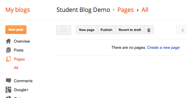
In your design menu, go to Pages, and then press the New page button at the top.


Name your page - About Me and Bio are typical names for this. You can always rename it later.

(This example was for something different.)


Add in the Content


Edit the page the same way you have been editing posts. This time, you need a photo (a semi professional one), a paragraph of bio info (you don't need as much as this example), and then your elevator pitch. (If you did not write your elevator pitch yet, the instructions are here.)

You only need 1 paragraph of bio info.
Instead of Skills, copy&paste your elevator pitch in here!


When finished, press the Publish button.

And... nothing happens.

That's because pages aren't blog posts - they come up by choosing them from a menu, as opposed to being displayed sequentially on your home page. So...

Add the Pages Gadget:


Now you need to go to your Gadgets in the layout menu, and scroll down to find the Pages gadget. Click the plus to add it.


This Pages gadget is basically a Pages Menu gadget.

Page names are on the left, and will only appear in the menu if you have their boxes checked.

Once the pages are checked, you may reorder them on the right side.  By convention, you should either place the Home page first or last.

(Yours will be Bio or About Me, instead of Graphics.)

Press Save when finished.


You may either position your Pages menu in one of the sidebar gadget spots, or...


... in a gadget at the top, in which case it looks like either a menu bar or tabs.


If your gadget doesn't show up, try moving it to a different location.


Test out the link in your gadget to make sure it is working.

Revisit your page now and then to keep it updated!


Here's another quick reference from Blogger on some of the details of pages and the pages gadget that were not covered above: Blogger Buzz

Friday, September 18, 2015

Create an HTML Gadget with links and images

Get the files

Head over to this post to get the 2 images you need for this gadget. Once you have them downloaded and saved then you are ready to continue!

What are we doing?

We are going to create a new gadget (widget) for your blog. This gadget contains the HTML (the code behind web pages) needed to show the 2 images, along with links to our websites.

Even though this will be a gadget, we are going to start out creating it in a post, where we will have more room to work, and where we will be able to upload the images.

Upload the images into a new post

Create a new post on your blog.

Click the image icon (to the right of link), and upload the two images from the other post.

Make sure you click on each to get a blue border around them.


In the Compose view of your post, you'll see the two images.

DO NOT:
  • drag the images
  • right or left align the image
  • add captions
  • In fact, don't even click on them.
If you do the above things, Blogger adds a bunch of code to make them happen - and we don't want to deal with that!!

We now switch to HTML mode - and will stay there. Click the HTML button in the above left corner.

(Going back to Compose view and changing anything will cause Blogger to insert extra HTML or modify HTML - making your code look different than that shown in this tutorial.)


Remove the extra code


In HTML view - these are tags. HTML uses tags to set the structure of your page. Tags are enclosed inside a "less than" and a "greater than".


Carefully select and delete the "a" tags, leaving only the "img" tags as shown below. The "a" tag makes a link. In this case Blogger made each image a link to a bigger version of the image, which we don't want for the gadget.


You may also see "div" tags, which you should also delete.

Delete everything except the code shown below -  yours should look just like this!:


Now you should just have the two image (img) tags as shown above.


Add links


Stay in HTML view.


The "a" tag makes links.  
Type in the "a" tags as shown here, three under the first image and three under the second. Also add in the "br" (break) tags as shown. Those are what makes the web browser go to the next line to display whatever is next. 


The actual blank lines in the code above are only to make our code more readable - they won't show up in the browser.


Set image widths and floats


Inside each image tag, after border="0", type a space and then add the parameters shown to set a width of 30% for the image, and to float it to the left. You must get all the punctuation just right, as shown.  If there is a height declared, delete it.


Go up and click on the preview button, and you'll see something like this:


Now that each image floats left, whatever is on the page after it can come up to the right of it (wrap), when there is room.

The e floating left allows the links to come up next to it like we want, but it also made the raven to come up - which we will fix next.


In HTML view, inside the br tags after the sets of 3 links, add in the style shown, like the first one shown here. Clearing makes the browser go below the floated image to place whatever comes next.


Now hit the preview button again.

The br with the added style to clear the floats made the raven appear below the e.


Add an image margin


The links are appearing a little too close to the images, so in HTML view, and inside the quotes for the style in the image tags, add margin:6px;.


Here's how your complete style attribute for the image tag should look now - along with the width.


And here's the complete image tag:


Almost there!

Now if you Preview, it looks pretty good.


Round the sharp corners


The e logo is very rounded, and the raven has sharp corners. Here's how you can round out the corners a bit: Add in one more thing to the code. In the image style, add border-radius:6px;.
Check it with Preview if you want.

Copy the HTML to a gadget


Your code now looks like this. If it does, select it all, and then copy it (command-c).

Save your post, but don't publish it.


Go to edit the Design of your blog.

In that menu, choose Layout.


Find your sidebar, and click Add a Gadget.


From the list of available gadgets (known on most blogging platforms as widgets), choose the HTML/JavaScript gadget.


Paste your code (command-v) into the Content window, and title the gadget.

Press the Save button.


Up at the top, click the View blog button.


Your gadget should look something like this!

Your fonts, font sizes, and colors will be different than mine, depending on the template that you are using for your blog.


Clean it up


Click the "tools" icon to edit your gadget.


It will look better to make the links line up with the tops of the images, so select the br tag between the image and the first link, and delete it. Do this for both images. Save.


Now we just need to give that heading a little room underneath. Click the edit button again.


Add a br tag as shown, above the first image only.


Testing and done!


Nice!

Test all 6 of your links to make sure they work. This blog gadget is public on the Web when we save it. It's embarrassing to hear from others that one or more of your links don't work. Test all of your links so that you will be the first to know - and then fix them!

If your sidebar is too narrow and the links don't fit well next to the images, you can try changing the width for the images - maybe down to 25% or even 20%.


Purposes of this tutorial

  • It gives you a useful gadget for keeping up with what's going on in e-Comm and ONW.
  • It hopefully gives you at least a fuzzy idea of HTML tags. You used 3 in this tutorial - the a tag to make a link, the img tag for an image, and the br tag to advance to the next line or insert a blank line. We didn't cover the "how" or "why" behind each tag, so don't worry if it seemed complicated or mysterious to you. When we make tags ourselves later on, they will be simpler - and we'll take them one piece at a time. For now, it is enough that you realize that things showing up on web pages are actually generated using HTML tags. Most of the time we have software generating the code for us, but we do need to know enough to look under the hood and tweak things when needed.
  • The other purpose of this tutorial is to demonstrate one way to present a tutorial blog post. To see more examples, click the tutorial label (tag) in the label cloud (tag cloud) to the right.
    To see how your tutorial blog posts are evaluated, go here.


Wednesday, February 25, 2015

How to add a logo to your Blogger banner

My Blogger template doesn't have an option for a header logo, whatever will I do?

Use this simple CSS "hack" to insert your logo in the background of the header!


Before:

So, here's the header for this blog - the way it looked without our logo.


Uploading the image:

Our logo had not been used in any posts up to this point, so we made a new post, clicked the button to add an image (right of the Link button) and uploaded it.  This logo is white, with a transparent background, so it doesn't show on the white post background you see here. (We then saved this post, but didn't publish it.)


Grabbing the image's URL:

We clicked on the HTML button to see the code.  Yeah, it looks scary, but don't worry - it won't hurt you.
We located the image tag (it has img in it) and selected and copied the url of the image that we fount between the quotes.


Locating the applicable CSS:


In another browser tab (using Firefox or Chrome), we selected everything in our header, and chose Inspect Element.


We clicked up the list of code statements on the left, until we found the one that had the blue header background in it - figuring that this would also be the section where we should put the background image.  Looks like this div is in a class called .header-outer.


Hacking the CSS!:

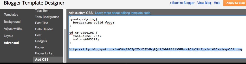
Back in the other tab, we did Design > Template > Customize, then Advanced > Add CSS.

We pasted the URL of the logo image that we copied a few steps ago, just to have it here.


In the other tab, back in the CSS showing at the lower-right, we copied the .header-outer part.


Then we pasted that in front of the logo's url - and added in the rest of the CSS you see here.  Don't forget the starting and closing braces.

You can experiment with the other CSS rules for background and padding - these are just the settings that worked for our particular blog template.  Yours will be different.


After:

Once the preview shows it looking the way we want, we press the orange Apply to Blog button, and there we go!


Do you have a request for a Blogger How-To tutorial?  Comment below to let us know!


Wednesday, December 17, 2014

One space or two between sentences?

On Blogger it's ONE.

Cutting to the chase...

In the one versus two space debate -- practically speaking, if you use two spaces between sentences in your Blogger pages or posts, they will sometimes wrap, causing some lines of continuing text to be indented by one space. So - for Blogger anyway, only use one space between sentences. (In Web design in general, multiple spaces are condensed down to one anyway, so it doesn't matter. For some reason Blogger is different, and it inserts a code to force as many spaces as you want.)

Here's an illustration of Blogger's two-space issue in the following paragraph. The sentences are all separated by two spaces:

The beginning of the 3rd line has alignment issues, due to my 2nd space.

The Debate (Blogger aside)

Is it actually wrong to use two spaces between sentences?

Yes. And... no.

It depends on who you talk to!  And, it depends on the setting.  (Are you typing a blog post, a letter, text for a poster, etc.?)  Believe it or not, it may also depend on the image you wish to convey of yourself.

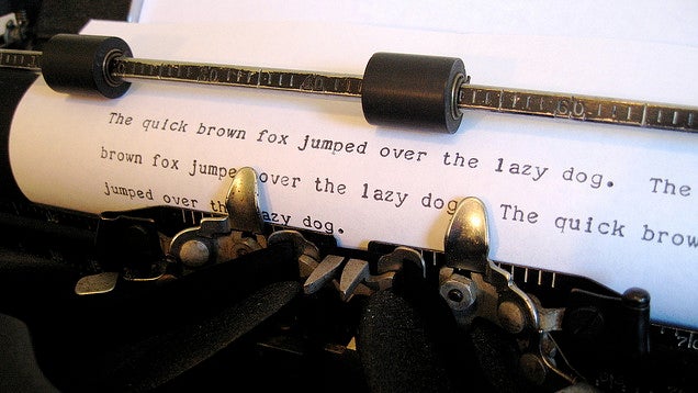
Two spaces between sentences was the convention in the days of the mechanical typewriter, which had monospaced characters. It took two spaces after a period to give enough visual breathing room before the next sentence.

In the digital era, the two-space convention has lingered, even though it is not necessary (especially with those of us old enough to have learned to type on actual typewriters).


The Two-space Haters

www.cultofpedagogy.com/two-spaces-after-period/
These days, the convention is to use one space between sentences. There are those who interpret this very strictly, and insist that using two spaces is very wrong. They have some good points.

One is Jennifer Gonzalez at Cult of Pedagogy.


Farhad Manjoo puts it this way in his essay on Slate.com (Space Invaders):
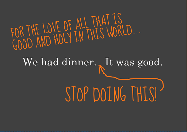
Typing two spaces after a period is totally, completely, utterly, and inarguably wrong.

The Official Word for Writers

The Chicago Manual of Style and the MLA Handbook both concur that the current convention for most situations is to use one space after a period. They do, however, leave some wiggle room (www.mlahandbook.org/fragment/faq).
Publications in the United States today usually have the same spacing after a punctuation mark as between words on the same line. Since word processors make available the same fonts used by typesetters for printed works, many writers, influenced by the look of typeset publications, now leave only one space after a concluding punctuation mark. In addition, most publishers’ guidelines for preparing electronic manuscripts ask authors to type only the spaces that are to appear in print. 
Because it is increasingly common for papers and manuscripts to be prepared with a single space after all punctuation marks, this spacing is shown in the examples in the MLA Handbook and the MLA Style Manual. As a practical matter, however, there is nothing wrong with using two spaces after concluding punctuation marks unless an instructor or editor requests that you do otherwise.

For Graphic Designers and Desktop Publishers

Some graphic designers are among the strict one-space disciples. Others will tell you that what matters is readability - and if two spaces look more readable than one in a certain situation, then use two. Here are some of the ins and outs of the issue at desktoppub.about.com, including this reasonable recommendation:
The Bottom Line: Professional typesetters, designers, desktop publishers, and anyone who truly cares about fonts and typography should use only one space after a period or other ending punctuation. However, it doesn't necessarily need to be a standard space character. Desktop Publishing software makes it easy to experiment with other space characters to achieve the best appearance on a case-by-case basis. Save the double spaces for typewriting, casual email, term papers (if prescribed by the style guide you are using), or personal correspondence. Learn how to remove extra spaces between sentences. For everyone else, do whatever makes you feel good.

Your Spaces Give You Away

One final consideration - when applying for a job with a company that is inclined to want younger folks as employees, you may want to stick with the one-space rule in your cover letter and resume. Typing two spaces between sentences identifies you as someone who probably learned typing back when the convention was two spaces.

Check these out: Double Spacing After a Period Could Reveal Your Age and Nothing Says Over 40 Like Two Spaces after a Period!

My Problem (Mr. Olson)

I think that sometimes two spaces after sentences makes text more readable. However, I do want to change over to using just one -- on Blogger, I have to. There's a slight problem though....

9th Grade Typing Class, 1976
Spacing twice after sentences is a very difficult habit to unlearn. It was drilled into us repeatedly in 9th-grade typing class. Every period I have ever typed at the end of a sentence in the 38 years since then has been followed by two spaces. It's hard-wired into my brain and my muscle memory. You'll likely see evidence of that in many of my Blogger posts!

I have to concentrate really hard to make myself hit the space bar only once after a period. So, if you see me twitching slightly or making funny faces as I'm typing, you know why!