What's a Favicon?
FAVorites ICON
The favicon is a very small, square graphic that shows up in browser tabs and other places - favorites (bookmarks), other blog feeds, and more.
You may make your own favicon, and install it on your blog.
The trick is to remember two words:
- Square -- The favicon must be square - Blogger will not accept it if it is even 1 pixel off.
- Simple --To turn out legible at such a small size, it must be simple - in shape and in color. Favicons are sometimes one letter, or a simplified version of a logo or icon.
You can make it in either Photoshop or Illustrator, though you will probably have better results with Illustrator. The example below is done with Illustrator.
Start with a square image - at a size easy to work with.
Transparency is allowed (PNG and GIF do transparency, JPG no) but I usually avoid it when making favicons.
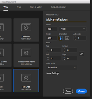
So, start out with a square artboard in Illustrator. I used 400px x 400px. Create.
*** There is a setting you need to tweak so that things won't turn to mush when we shrink this thing down to icon size:
Before you start working, go up to Adobe Illustrator > preferences > general >make sure the two checkboxes to resize corners and resize strokes and effects are checked.
To make a favicon of your initial, type the initial, and size it to fit in the artboard. If things are happening that you don't want, you may need to reset the character panel. (Click the hidden menu in the upper-right, and at the bottom, choose Reset.)
Anti-Aliasing is what is used to smooth out curves by adding in a lot of in-between colors. Normally this is a good thing. You'll see different options - sharp, crisp, and strong.
Probably, once this is sized down very small, it will actually look cleaner without any anti-aliasing, so choose none. The edges will look jagged and blocky, because now illustrator is only using one color for the edge.
Right now, the artboard is the only thing in back.
Use the rectangle tool to make a square, with any fill color that you want. Make sure you have contrasting color between the rectangle and your initial in the foreground.
After the rectangle is made, right-click it and Arrange > Send to Back.
Open up your artboards panel.
Make a new artboard by clicking the icon next to the trash can.
Click (double-click?) the names of your artboards to rename them.
Up in the bar, resize the W and the H of your favicon artboard to 16px by 16px.
Select both your rectangle and your initial (drag a box around them both, or click one and then shift-click the other) - and then Option-Drag to make a copy of your work.
Holding down Shift, start sizing down your rectangle and initial to fit on the small artboard.
Zoom way in on your favicon artboard, and make sure that the rectangle and the initial are fitting entirely on the artboard.
Now you can zoom back out to 100% size, and check to see if the None option for anti-aliasing is what you want. You can open the character panel and try on of the other options. Go with whatever looks cleanest when you are viewing it at its actually tiny size.
Does it look best with antialiasing?
...
or without?
When you are ready, File > Export > Save for Web. Use PNG-24, and uncheck transparency.
Make sure you have Clip to Artboard checked.
Make sure the size is 16px x 16px.
If something looks wrong, go back and fix it.
In this case, my square and letter were not fitting exactly on the artboard.
I went back, selected the rectangle, opened the shape panel, and set it back to 16px by 16px, and then made sure the square fit exactly to the artboard.
I also then had to move the initial over a bit.
To get things to fit the way you want, you may need to uncheck snapping - under View in the main menu.
Now when I Save for Web, it looks better.
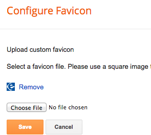
Go to your layout settings in Blogger, and select your icon for the Favicon gadget.
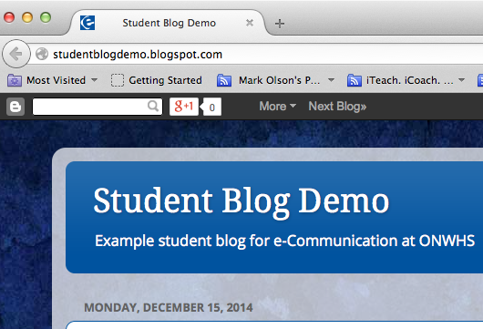
You may not see it change right away in your browser tab. If you are in Chrome or Firefox, Command-Shift+Delete will clear the browser cache and history, and force it to reload your new favicon. (It will also log you out of Blogger, though.)
Websites nowadays actually can use several different sizes of favicons for different purposes - one for tabs, another for icons on a tablet, another for mobile devices, etc.
If you open up your blog on a device that uses a larger size (which will make your 16x16 look fuzzy), let us all know please! Leave a comment below, and we can modify these instructions for a bigger save size.
Have fun personalizing your blog with a favicon! As with everything else, keep it
classy.
If you'd like to find out more of the finer points of favicons for website use, this is a good page:
Create a favicon for your site in 8 steps


